

How to Hide a Mobile Menu in WordPress
Looking for a way to hide the mobile menu in WordPress?
Most WordPress themes have the features to transform menus into different devices. The theme automatically transfers the default menu for different screen ratios. But you can disable these features and want to style your navigation menu on mobile devices. You can use a different menu style on your mobile device.
Here in this article, we will show the easiest way to hide the mobile menu in WordPress.
Hide a Mobile Menu in WordPress
There are different ways to hide the mobile menu. You can use CSS code or use a plugin to hide the menu. Using a plugin is the easiest way. Here in this tutorial, you will show how to hide the menu using a plugin.
With the help of the plugin, we will disable the default menu offered by the theme and create a new menu for mobile devices.
Go to Appearance > Menus, from where you can create a new menu for the mobile devices.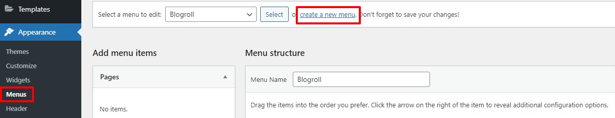
Click on the create a new menu option and then add a menu name for the mobile devices and add the item to show under the menu.
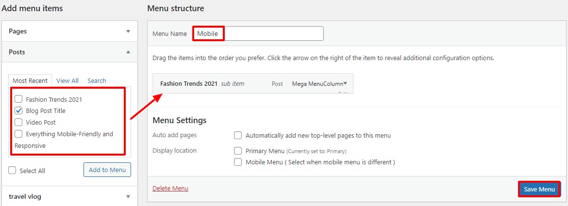
From the add menu item on the left side select the item and click on the Add to Menu button. After that click on the Save Menu button.
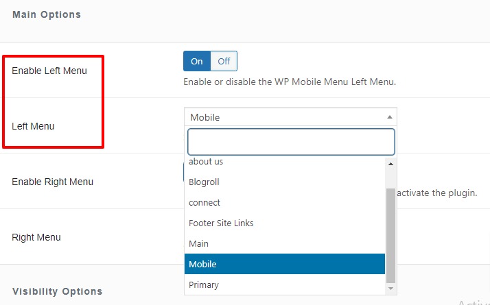
Your menu is fully done now you need to implement it on mobile devices. Before that install and activate the WP Mobile Menu – The Mobile-Friendly Responsive Menu WordPress plugin.
Now go to the Mobile menu option and then select the place where you want to display the menu. From the menu option enable the left menu and from the dropdown select the mobile menu you just created.
.Now scroll down to find the Hide Original Theme Menu option. From here you need to set the mobile menu and hold the default one for mobile devices.
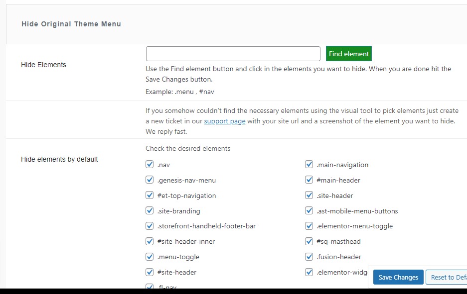
The plugin automatically detects the element so there is not anything you can do. If the plugin is unable to hide the menu then come here and choose the elements.
Click on the Save changes button to save the changes.
Now you need to display the menu on a mobile device. For this go to Appearance >Menus. Now from the menu settings option choose the left mobile menu and then click on the Save button.

Now go to your website on mobile devices and see your menu.
We hope this article will help you. You can also see our other tutorials to learn How to add author info in WordPress posts
How to Add Business Hours in WordPress
If you like this article please like our Facebook Page to stay connected.